
Creating InDesign content for phones
Introducing 'Phone XL'
With the release of Twixl Publisher 22.2, we introduced a significant new feature for users who create content using InDesign: the ‘Phone XL’ layout. This new layout is optimized for the latest iPhones and Android phones, providing a better fit for nearly all recent models.
Below are examples of both the traditional 'Phone' layout (16:9) and the new 'Phone XL' layout (19.5:9)
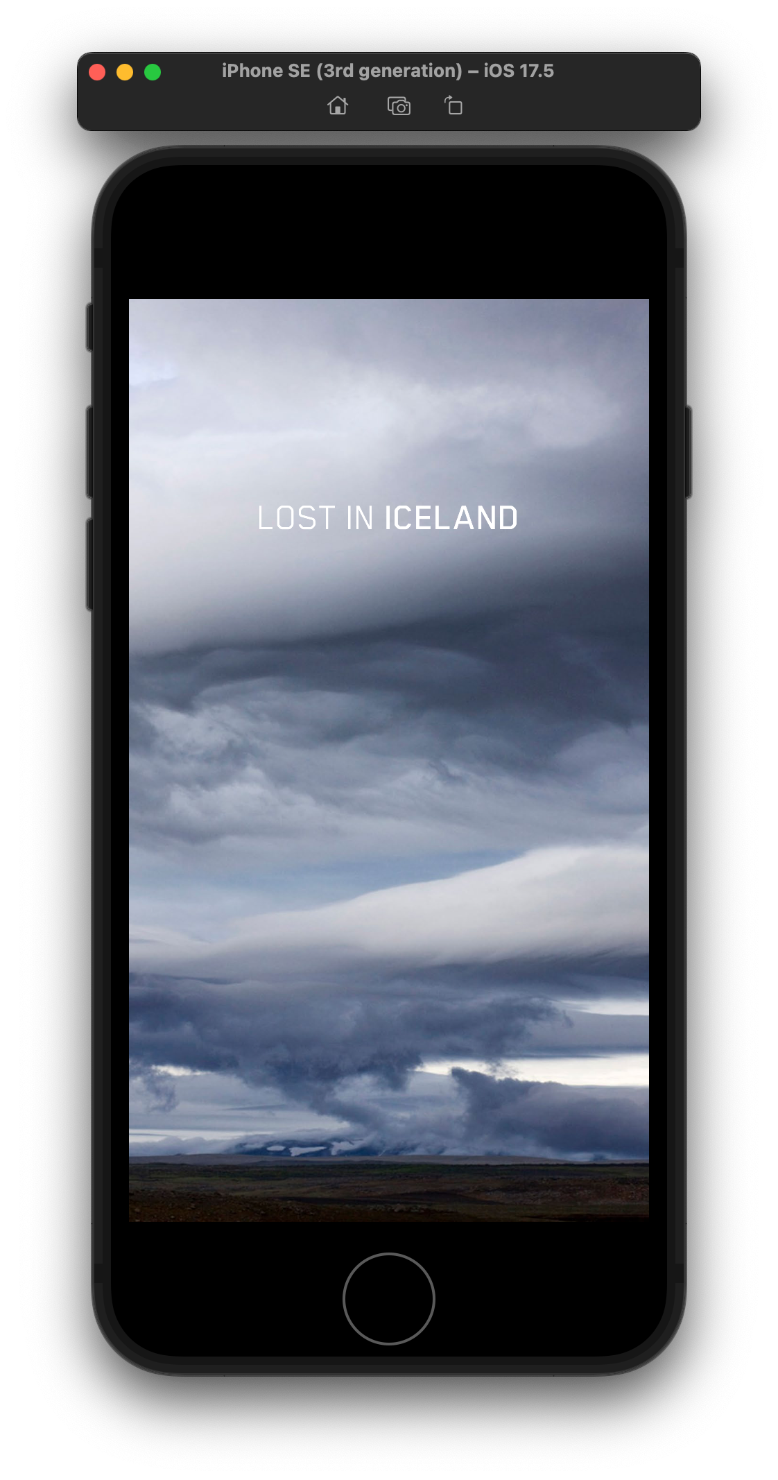
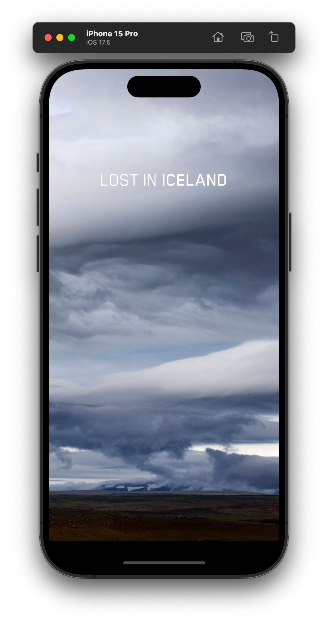
Traditionally, the Twixl ‘Phone’ layout in InDesign had a 16 by 9 aspect ratio with 568 by 320 pixels. On newer phones, this can lead to some letterboxing. The new ‘Phone XL’ layout is taller, and has a 19.5 by 9 aspect ratio with 852 by 393 pixels. This is the exact aspect ratio for all iPhones since the iPhone X, except for the iPhone SE. It also matches the aspect ratio of most popular Android phones more closely.
If you were already creating content for phones, then don’t worry: you don’t necessarily have to recreate all your existing content. But for new content, we heartily recommend using the ‘Phone XL’ layout, as it will allow you to optimally target almost all phones.
From now on InDesign content for phones will be handled on the device as follows:
- if you have both a ‘Phone’ and ‘Phone XL’ layout, then the one that most closely matches the aspect ratio of the phone will be used
- if you only have the traditional ‘phone’ layout, then that one will be used for all phones
- if you only create a ‘Phone XL’ layout, then that one will be used for all phones
If you are thinking about creating new content using the 'Phone XL' format, keep in mind that you'll need to make sure that you update your app to the latest Twixl release first.