
What should always be one tap away?

A practical guide to the Twixl Tab Bar
Open your app for a moment and imagine seeing it through the eyes of someone who had no part in building it. They came for one thing, perhaps the latest issue, a product presentation before a customer meeting or a document downloaded yesterday. They know it must be somewhere in the app. Where would they tap first?
For the people who manage an app every day, the answer often feels obvious because they know how the content is organised, what sits behind the menu icon and what every label means. Readers arrive without that map in their head and simply want to get somewhere.
That is where the Tab Bar can make a real difference. It gives up to five destinations a permanent place at the bottom of the screen on phones and tablets, allowing readers to see their next step immediately without first opening a menu or remembering how the app is structured.
Choosing those five destinations is the part that deserves attention.
Go back to the reason people open the app
Before looking at settings or icons, think about the moments in which the app is used.
A reader may open a publication app to find the newest issue or return to something saved for later. A salesperson may need the right presentation while sitting across from a customer. An employee may want a document, an update or the details of an upcoming event. In each case, the app has only a few seconds to help.
The original navigation was probably designed around moments like these, although the app may have grown considerably since then as new sections were added, priorities changed and useful features arrived. The choices made at launch may no longer reflect what people need today.
The Tab Bar offers a good reason to look at that journey again. Which destinations should be immediately available every time someone opens the app? Which actions should never feel hidden?
Look at the numbers, then look behind them
Twixl Analytics can help. If readers repeatedly visit a particular section, that is a strong sign that it matters. When reaching it currently takes several taps, a place in the Tab Bar may remove friction from a journey people already make.
Low usage tells a less obvious story, because a section may be less useful than expected or may simply be unknown to readers. It could be tucked away in the Sidebar, require an extra tap or carry a label that only makes sense to the team that created it, so the same number can point to low interest or poor visibility.
That is why analytics should be read alongside the original purpose of the app. The data shows what people do, while the context around the app helps explain why they may be doing it.
A useful discussion starts with questions such as:
- Are people reaching the sections we expected them to use most?
- Which common journey is longer than it needs to be?
- Is valuable content being overlooked because it is difficult to find?
- Is there something new that now deserves a more prominent place?
Simply selecting the five most visited sections is unlikely to produce the best Tab Bar. One may already be easy to reach, another may be used less often yet matter greatly at a specific moment, and a third may support a priority that the organisation wants to develop. The numbers help to frame the choice, with purpose and context completing the picture.
Five places, each with a clear reason
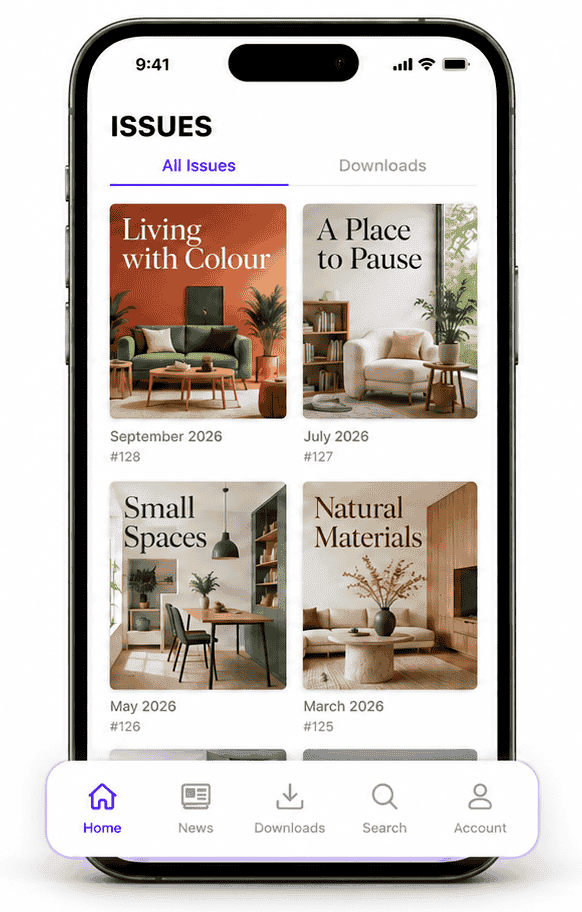
The Tab Bar can contain a maximum of five tabs, a useful limit that prevents quick navigation from becoming another crowded menu.
Each tab should answer a simple question: why does this need to remain visible?
The answer may lie in frequency, importance or discoverability, and it should be clear enough to explain in one sentence.
The label and icon then need to make that choice understandable at a glance, while the order should follow the way the app is actually used. Start with the place that feels like home and arrange the remaining destinations around the journeys readers are most likely to make.
Tabs can link to collections and functions within the app, or to an external website. That flexibility is valuable, although every destination should still feel like a natural part of the experience. A link can be technically possible and still feel out of place.
And what happens to the Sidebar?
Only after the Tab Bar has a clear role does it make sense to revisit the Sidebar.
The Sidebar can continue to hold the wider structure of the app: settings, account options, secondary sections and destinations people need occasionally. The Tab Bar takes care of the places that benefit from being one tap away.
There may be good reasons to repeat one or two destinations, especially while people get used to the new navigation. Copying the full structure into both places will usually make their respective roles harder to understand. The reader should quickly sense what belongs in the Tab Bar and when the Sidebar will help.
Try it with someone seeing it for the first time
Once the tabs have been configured using custom URLs, test the app on a real phone and tablet, check every link and then hand it to someone who was outside the discussion.
Ask that person to find an issue, open a key section or reach a particular service, and watch where they tap. A short hesitation can reveal more than another internal conversation about which icon looks best.
After launch, return to Twixl Analytics. Did a common journey become easier? Did a previously overlooked section start receiving attention? Is one tab barely used, and can you explain why?
Treat the first setup as a starting point, with the freedom to adjust the five visible choices as the app continues to change.
Start with one honest question
The Tab Bar is a small addition to the screen, yet it can change the whole experience for a reader who knows what they want and has no idea where you put it.
So open the app once more, set aside how it was built and what the navigation is called, and think only about the person arriving with something to do.
What should always be one tap away?
Further information
Learn how to configure the Twixl Tab Bar.
Explore the available custom URL schemes.